Overview
Spring is a well established health and fitness tracking app that launched three years ago. The app works for both iOS and Android users. Spring allows users to see how their friends and other users are doing in regards to their respective health and fitness goals. Most people set the intention to work and progress on their health goals however lose the motivation to do so.
Problem
Even the most well intentioned people embarking on a health/fitness journey have a hard time sticking to their goals. Spring’s data indicates that most users will download the app but by the three week mark will either abandon the app or delete it entirely.
Goals
Add in messaging features for users increase repeat usage and engagement
Solution
Appeal to the social aspect of sharing one’s progress by giving the option for users to create their own challenges with friends as well as sharing individual progress photos and updates while adding messaging features.
Discovery Phase
I conducted a series of secondary research to gain more insight on the following questions
Why do users infrequently use or entirely abandon apps?
What is the psychology behind motivation and staying motivated?
User abandonment in the fitness/health app space can be attributed to many factors. Based on current research, the main drivers seem to be the overwhelming amount of fitness apps available, apps not having the features users want, and a loss of motivation. Since we cannot control how many apps there are, we will focus the attention on the user’s need for certain features and the loss of motivation among users.
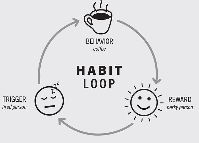
Not motivation but habit forming behavior
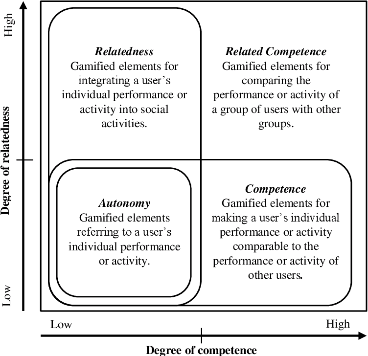
Gamification and Engagement
Gamification has a positive correlation with engagement. Gamification engages users by three ways:
Need for competence
Need for autonomy
Need for relatedness
The need for competence, autonomy, and relatedness satisfies human needs from a psychological standpoint thus driving user engagement. Achievement and progression oriented game elements positively influence user engagement. It’s important to note that despite the positive influence of the social aspect of an app, social-oriented game elements should be used cautiously because it can decrease engagement since it interferes with the user's sense of autonomy.
The need for relatedness can best be used for users to pick and choose their own communities within the app.
Research Findings
Based on the secondary research that I conducted, I think that gamification that influences social connection and easy habit forming behaviors will help drive user engagement. From a psychological standpoint, gamification that focuses on social and easy habit forming behaviors meets the user’s emotional needs as well as lessens mental load. Making habit forming behaviors easy for users will increase the likelihood of users meeting their fitness goals and in turn more inclined to share their process with other friends on the app.
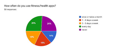
To validate the findings from what I found in my secondary research I conducted a survey from a small sample size. An online survey was sent out and completed by 50 people.
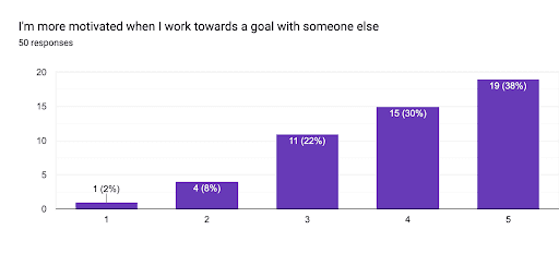
38% of users surveyed voted that they strongly agreed that they are more motivated when they work towards a goal with someone else
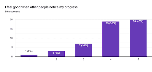
40% of people surveyed strongly agreed that they report feeling good when other people notice their progress
50% of users voted strongly agree to congratulating others on their achievements
Most users voted strongly agree to feeling overwhelmed if they have too many goals to meet
Results were varied when asked if the user would perform better if they knew that others were watching. 26% voted neutral.
Key Findings
Features that influence social connection among users will drive engagement - User’s like to share their progress and like to congratulate others on their progress as well.
Focusing on the social aspect of working out and a targeted easy goal with others will drive user behavior by meeting the user’s emotional needs for engagement and lowering the mental load for exercising.
Providing the option to share their progress or not will instill a sense of autonomy for the user to whether or not they choose to share their progress or not
Ideation Phase
How Might We…?
MOTIVATE people to continually pursue their fitness/health goals?
ALLEVIATE any negative feelings that might be associated with sharing one’s progress in their health journey?
MINIMIZE the mental load affiliated with staying consistent with fitness goals?
User Flow
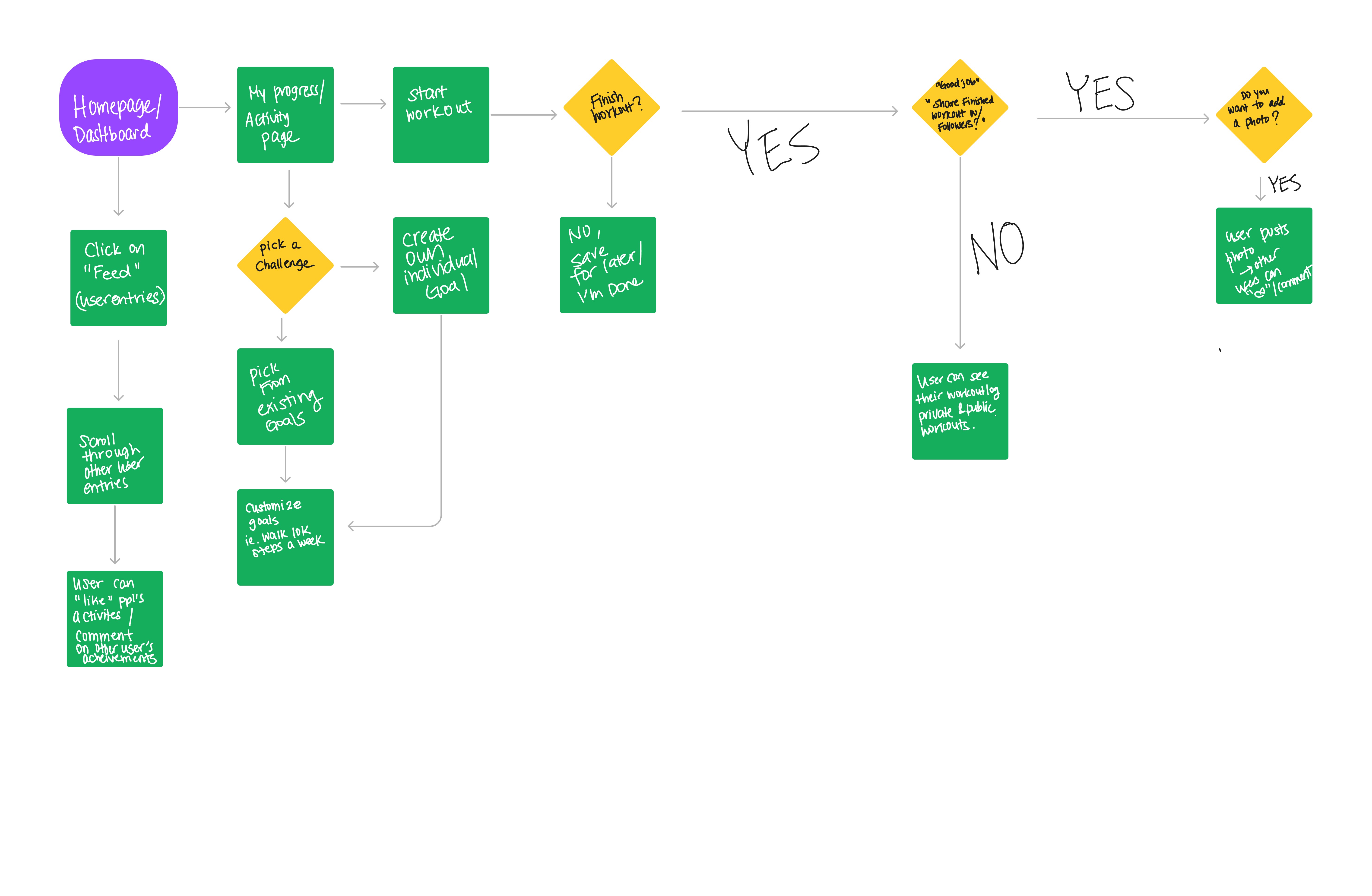
Route I. As a Spring app user I want to see what my friends are up to
Route II. As a Spring app user I want to create my own challenge
Route III. As a Spring app user I want the option to upload a personal note or photo after I complete my workout to my followers
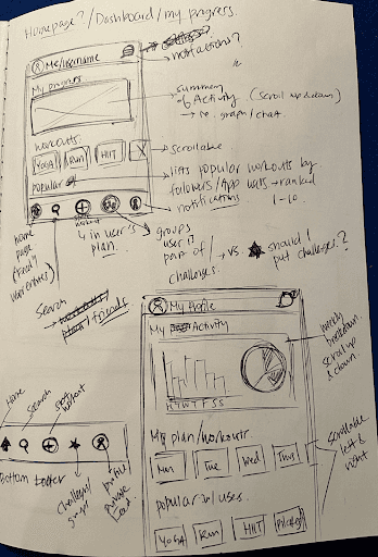
Sketching
The main goals I had in mind with the design of the app was that I wanted it to look familiar, easy to use and straight forward to minimize mental burden and decision fatigue.
Design Phase
Lo-Fidelity Wireframes
Lo-Fidelity Usability Testing
The objective of the usability test was to see if users can intuitively and seamlessly move through 3 main tasks:
Creating their own challenge group
Starting a workout and posting their own update
“Liking” and commenting on their friend’s updates
Issue 1
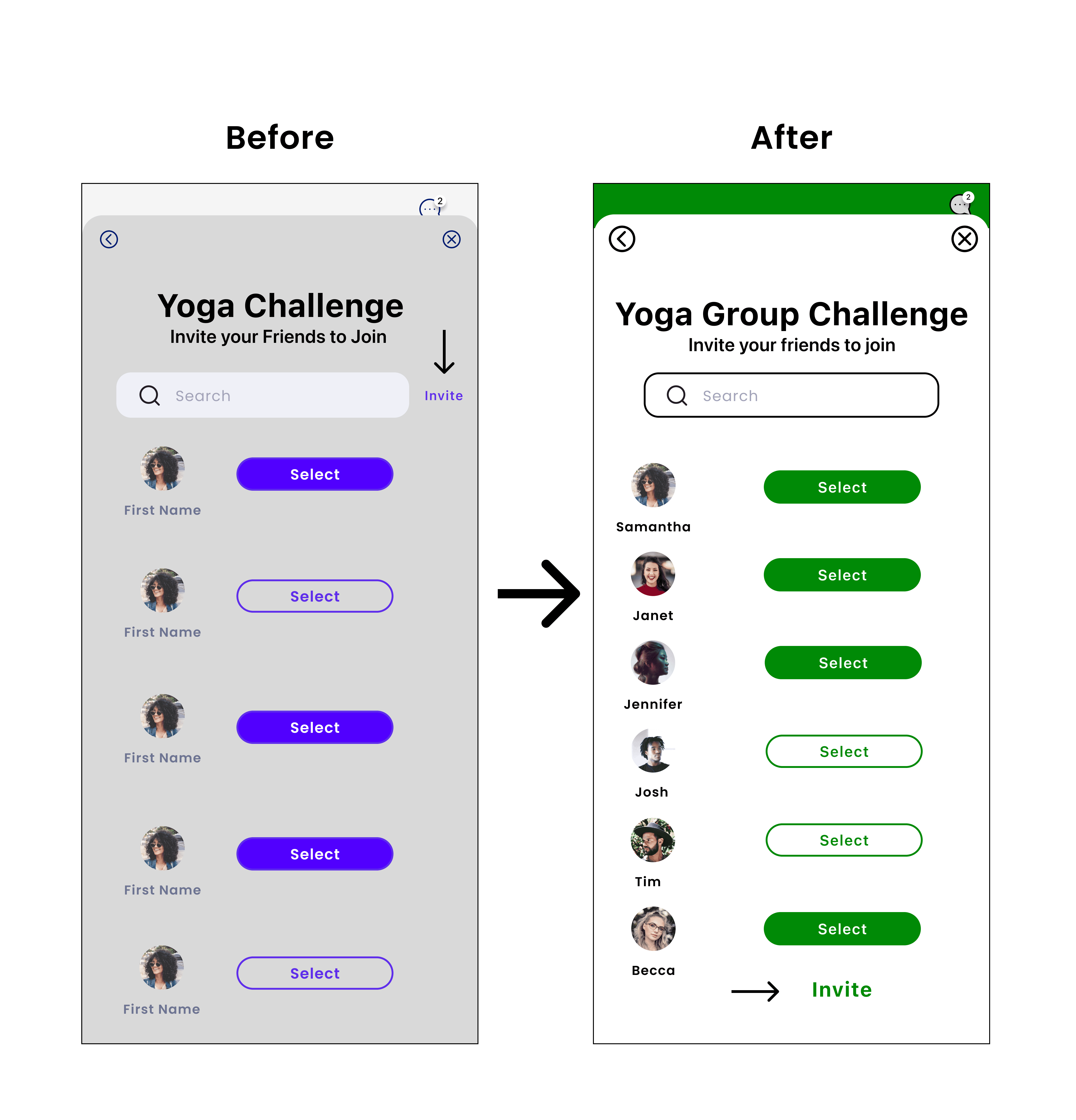
All users had a difficult time with inviting their friends to the group challenge.
Summary
All 5 users said that the invite button was either too small to see, or the placement of the button was confusing to them because it was too close to the search bar. All of them took the most amount of time trying to figure out what the next step is during this particular flow.
Reccommendation
Making the “invite” button bigger and in a more strategic place would be helpful so that the users know that that would be the next call to action button to move forward in their task flow.
Issue 2
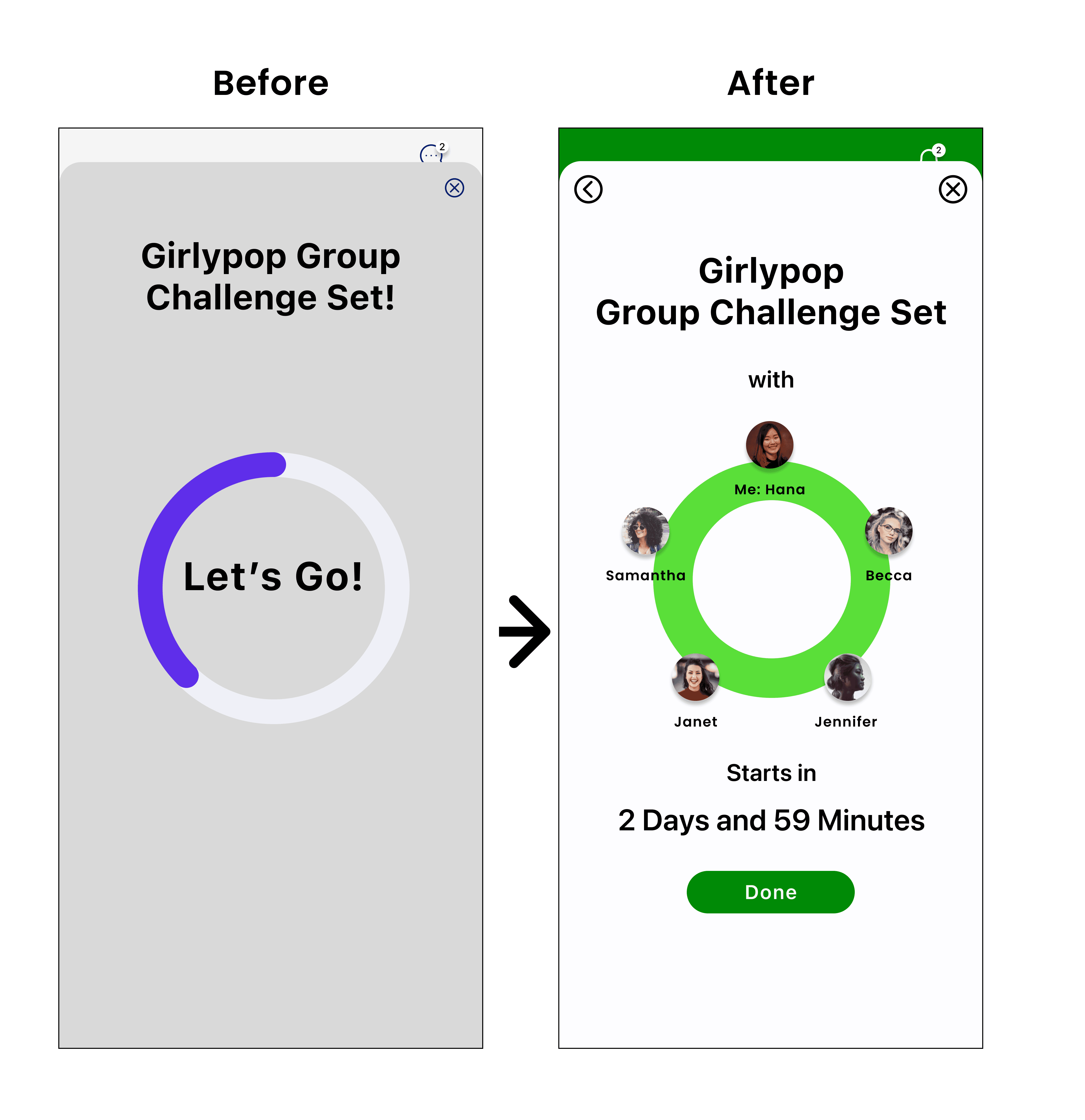
Summary
Reccommendation
3 out of 5 users had a hard time finding the exit/close button in creating their own challenge flow.
After completing all the tasks making their own challenge group, the last screen confused users because 3 out of 5 users couldn’t see the exit/close button.
Instead of having an exit/close button, I think that a larger done or finish button would help users indicate that they are done setting up their group challenge. A larger call to action done button will be a nice way to end their task.
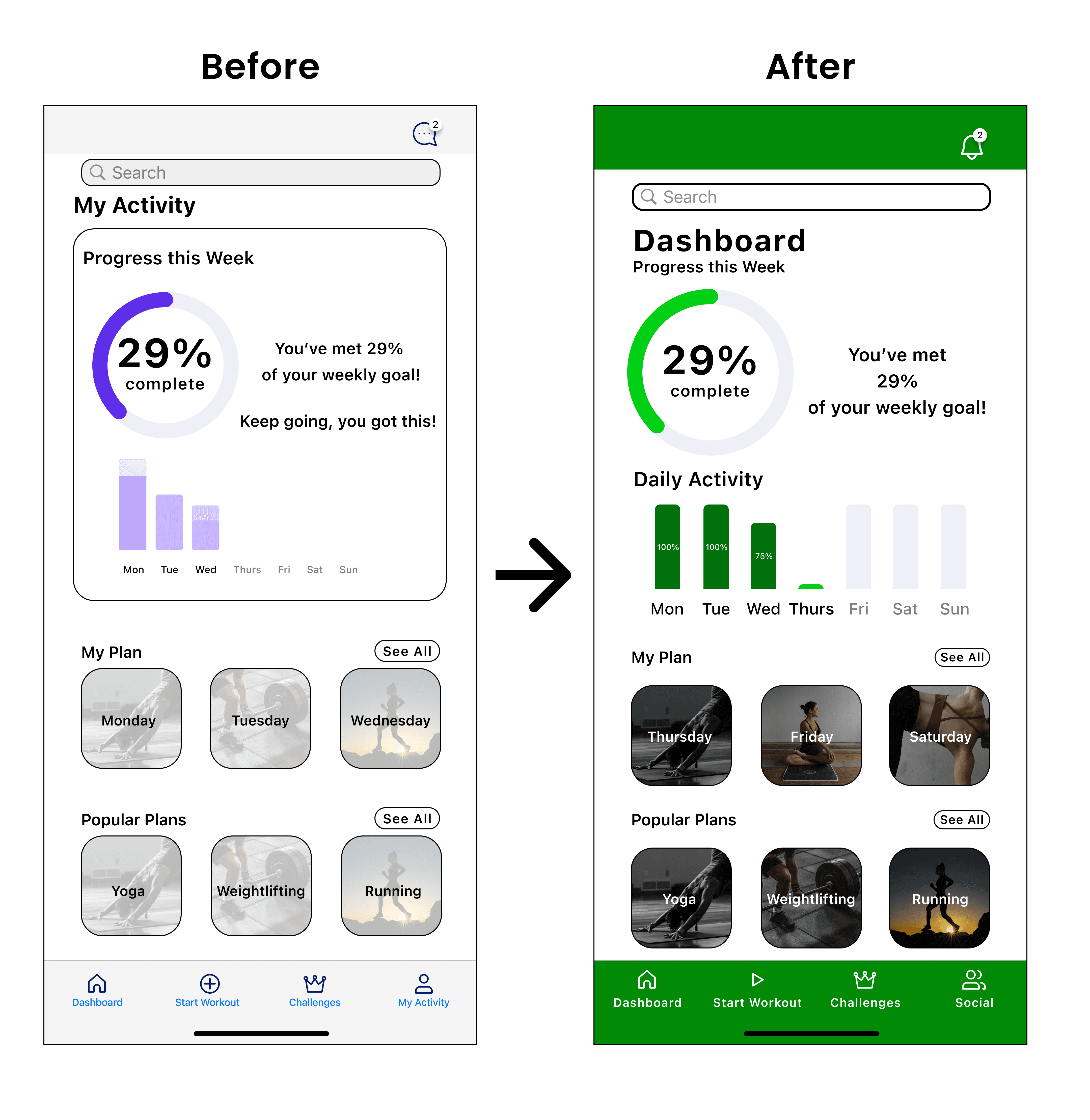
Issue 3
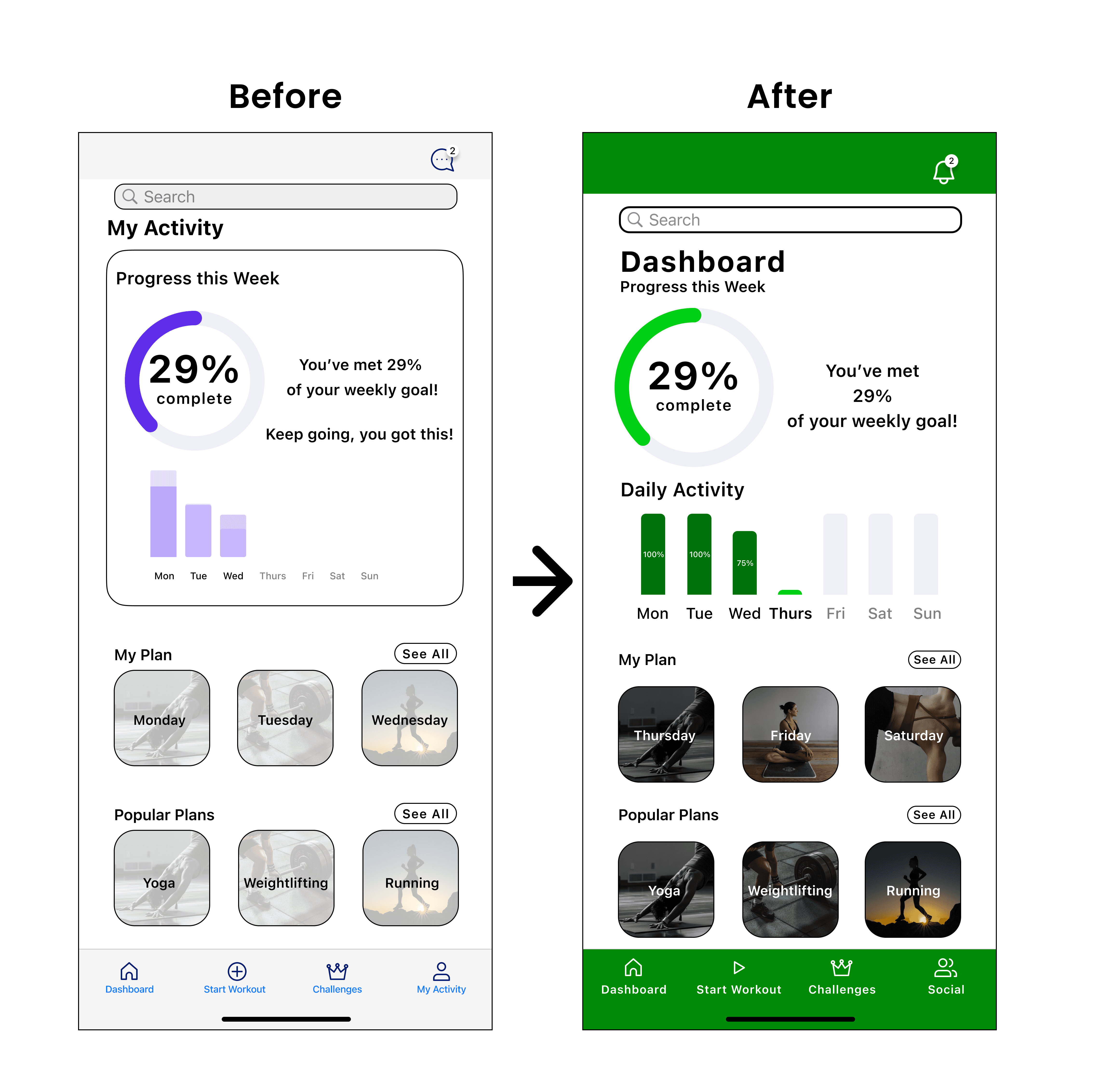
Summary
Reccommendation
3 out of 5 users struggled to find where a feed of their friend’s activity would be.
Many of them commented that the use of the word “dashboard” was confusing and thought that they were viewing the “my activity” page as the dashboard.
Remove the word dashboard and rename it something else, like “feed” to indicate the separation of the user’s personal page to the page where they can see their friend’s activity.
Issue 4
Summary
Reccommendation
2 out of 5 users were confused by the bars shown in the my activity page
All the users understood the activity wheel, but 2 out of 5 users were confused by the activity bars. They didn’t know what they were showing/representing.
I think that labeling or putting a percentage in the bar showing that the user completed their workout would be easier for the user to understand what the bars are showing. Perhaps using the percentage can show if the user completed 100% or 70% of their workout for that day.
Moodboard
Color
Font
I want users to feel calm, energized, and have a sense of being revitalized every time they open the Spring app. I like the symbolism behind the color green and how it represents freshness, growth, health, and positive energy. Various shades of green are used throughout the app so that the user can associate the Spring app with the color green.
I wanted the font to be very minimalistic, familiar and inviting. I chose SF Pro Text in various boldness in lettering to make the product look cohesive and streamlined. Poppins was used to label the avatars to add subtle distinction to user profile names.
High Fidelity Wireframes
High Fidelity Usability Testing
The objective of the usability test was to see if users can intuitively and seamlessly move through 3 main tasks:
Creating their own challenge group
Starting a workout and posting their own update
“Liking” and commenting on their friend’s updates
Issue 1
Summary
Reccommendation
Users were confused about the menu icons. More specifically which icon was for the dashboard, social feed, and start workout.
All 5 users were confused about the home page. All thought that the home page was their dashboard page and were confused that the home icon was used for the social feed page. 3 out of 5 users thought the start workout icon meant to add a new workout.
Replaced the home icon to dashboard and used a different icon for social feed page and start workout.
Issue 2
Summary
Reccommendation
Users commented on how some of the exercise tabs/card were hard to read
All 5 users commented that they couldn’t really read what was written on the cards of the exercise options.
lower the contrast in the images displayed in the cards so that the white font can be read and there are no visibility and readability issues.
Issue 3
Summary
Reccommendation
Users were confused as to what day of the week that the dashboard was showing.
4 out of 5 users commented that they would like to know which day of the week they were on. They wanted some kind of indicator of what day they were on for their workouts.
Use a different color to indicate what day of the week that the user was on.
Issue 4
Summary
Reccommendation
Users were confused about the chat box icon
All the users thought that the chat box icon was for messages and not for notifications
Switch out the chat box icon for a different icon, perhaps a bell icon to indicate that it’s for notifications.
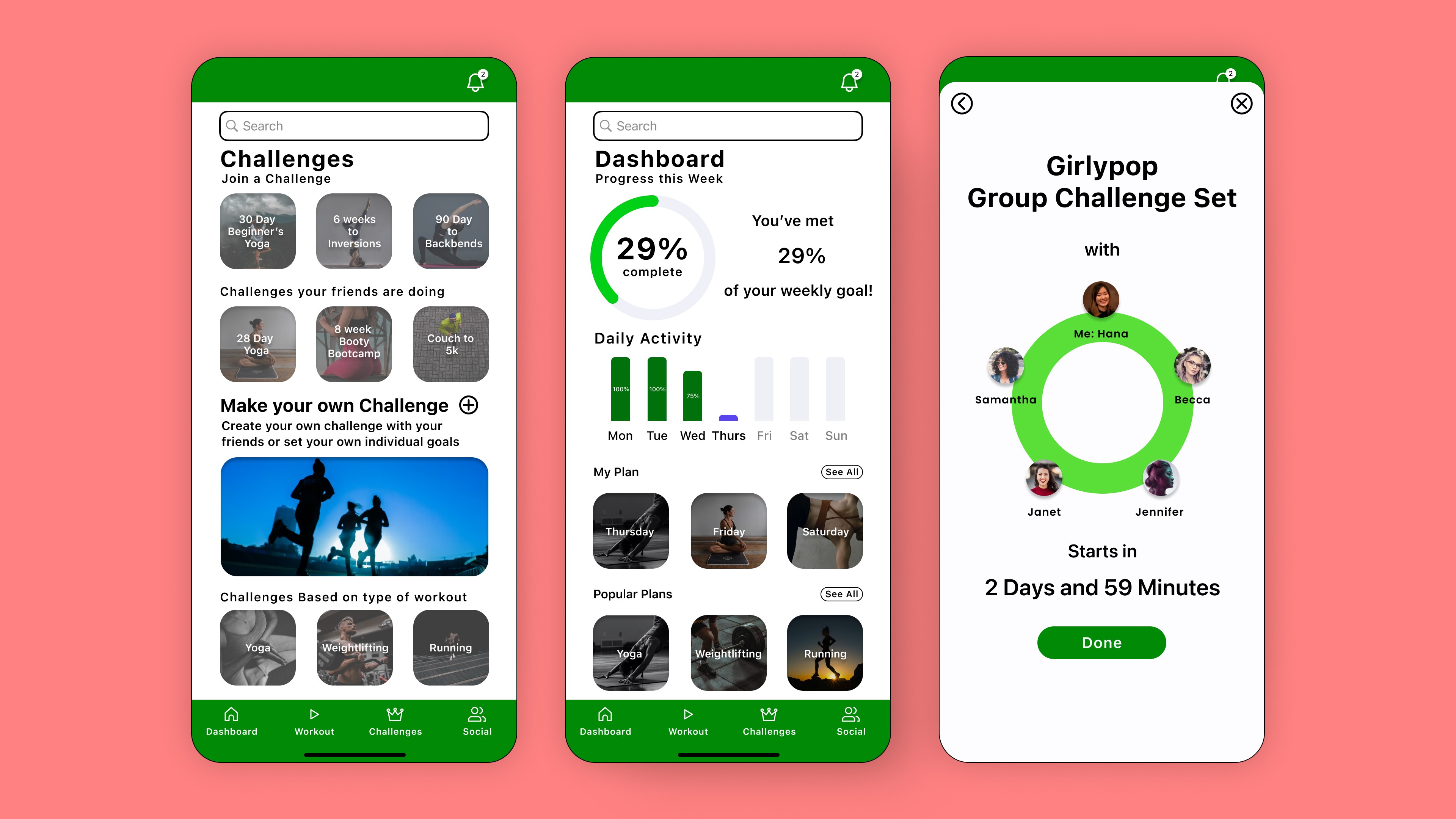
Final Design
Prototype
Reflection
Spring
A mobile wellness app that fosters a sense of community, empowering users to reach their fitness goals together
Role
Timeline
Tools
Methods
UX Designer
8 weeks
Figma, G Suite, FigJam
Research, User Surveys
Usability Testing, User Flows
Sketching, Wireframes,
High Fidelity Mockups, Prototyping
I thoroughly enjoyed the design process for this particular project because it was something that I have a big interest in. As a self proclaimed fitness and health junkie, it was nice to switch gears from being a user to designer. I understand the frustration that users face when using a fitness app because I too have abandoned or deleted countless health and fitness apps. I believe that my personal experience helps me empathize with what users want while also meeting the company’s business goals and expectations.
As my final project comes to a close, I am left feeling an immense amount of gratitude and wonder. I started from not knowing a thing about UX let alone the UX process and what it entails to now seeing everyday items I use as an experience and figure out ways to improve how we as humans experience the product. As challenging as it was, learning a new way to view how we experience and interact with a product; I am proud of the progress I made as a new designer. I cannot wait to see how I grow and develop as a designer in the future.